MEDIA | April 29, 2015
M7.8 Gorkha, Nepal Earthquake, April 25, 2015
In response to the April 25, 2015 M7.8 Gorkha, Nepal Earthquake, the ARIA project is providing valuable information for the ongoing response to the April 25, 2015 M7.8 Gorkha earthquake in Nepal. The quake has caused significant regional damage and a humanitarian crisis.
Damage Proxy Map
The data products include a Damage Proxy Map, which covers the region around Kathmandu, was processed by the Advanced Rapid Imaging and Analysis (ARIA) team at JPL and Caltech using X-band interferometric synthetic aperture radar data from ASI's COSMO-SkyMed satellite constellation. The technique uses a prototype algorithm to rapidly detect surface changes caused by natural or human-produced damage. The assessment technique is most sensitive to destruction of the built environment. When the radar images areas with little to no destruction, its image pixels are transparent. Increased opacity of the radar image pixels reflects damage, with areas in red reflecting the heaviest damage to cities and towns. The color variations from yellow to red indicate increasingly more significant ground surface change. The time span of the data for the change is Nov. 24, 2014 to April 29, 2015. Each pixel in the damage proxy map is about 100 feet (30 meters) across.
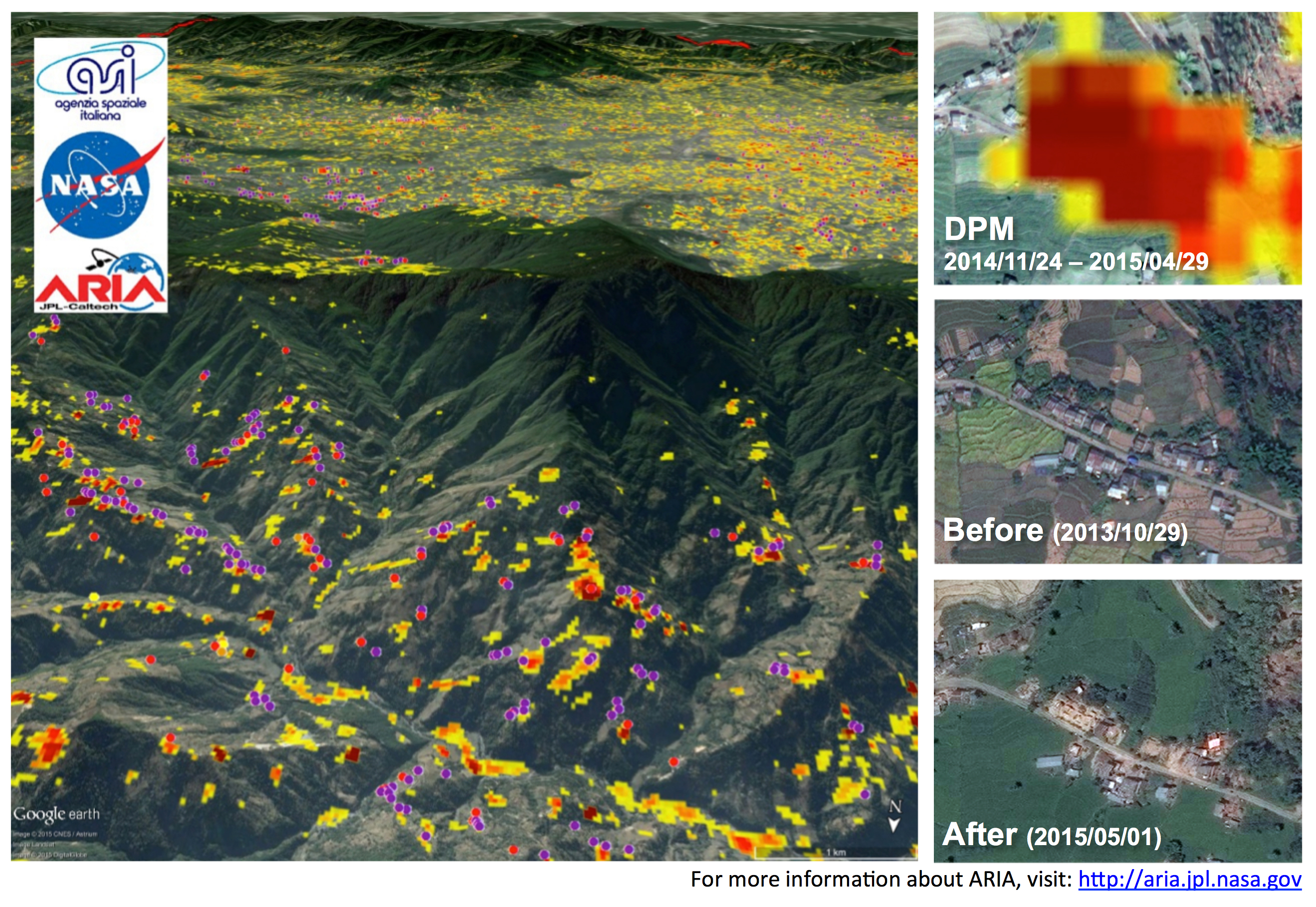
The perspective image (above) shows the DPM overlaid on the terrain with the locations of damaged buildings identified by the National Geospatial-Intelligence Agency (NGA) preliminary damage assessment, indicated by the red and purple dots. As an example, the images on the side show how red regions in the DPM correlate with damaged buildings, as shown by the collapsed structures in the "after" image. The base map images were provided by Google. Before and after images were provided by DigitalGlobe.
Surface Deformation and Fault Slip Model
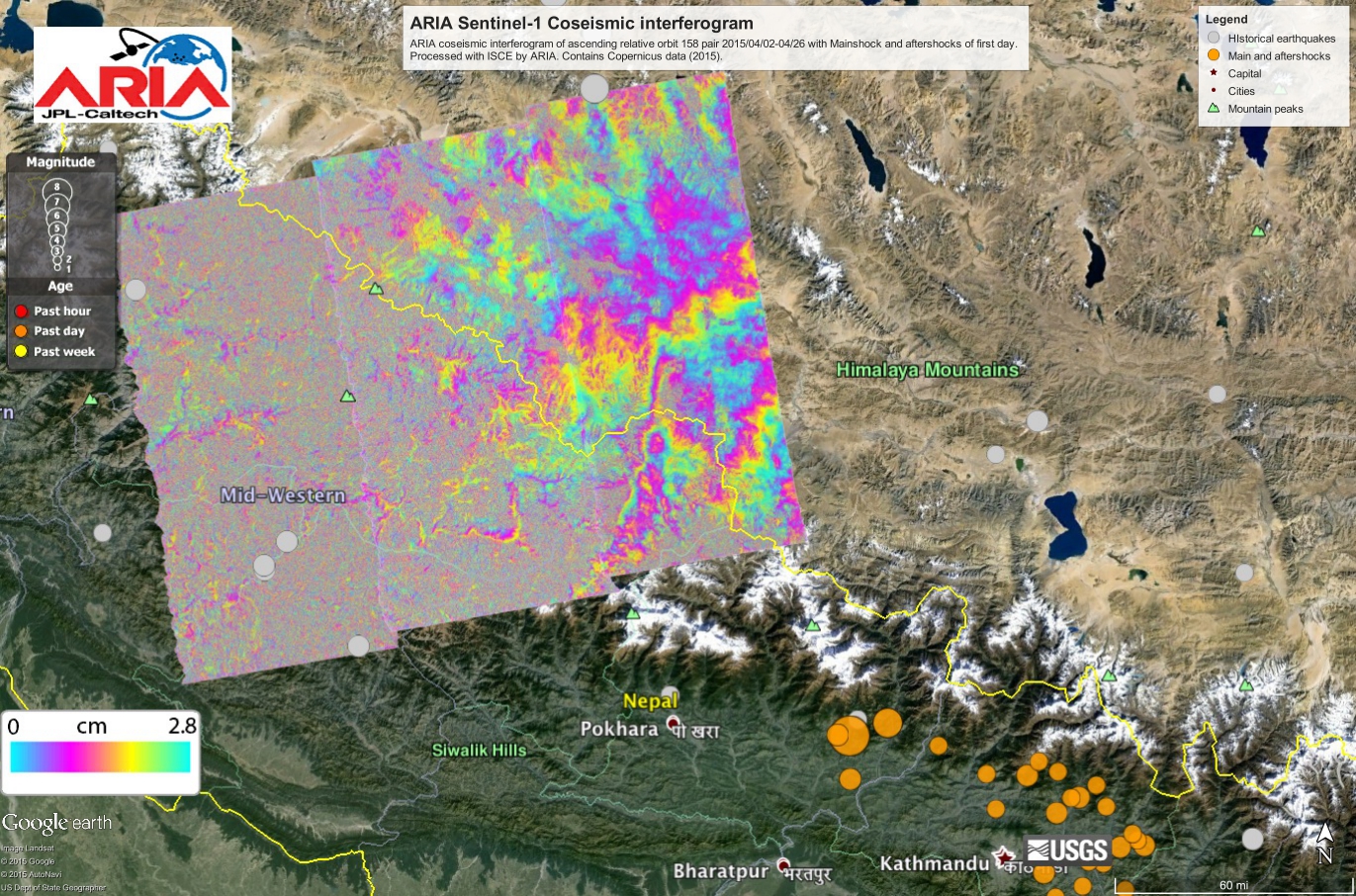
The ARIA team analyzed interferometric synthetic aperture radar images from the European Union’s Copernicus Sentinel-1A satellite, operated by the European Space Agency and also available from the Alaska Satellite Facility (https://www.asf.alaska.edu), to calculate a map of the deformation of Earth’s surface caused by the quake. This false-color map shows the amount of permanent surface movement caused almost entirely by the earthquake, as viewed by the satellite, during a 12-day interval between two Sentinel-1 images acquired on April 17 and April 29, 2015.
In the map, surface displacements are seen as color contours (or "fringes"), where each color cycle represents 8 inches (20 centimeters) of surface motion. The contours show the land around Kathmandu has moved upward by more than 40 inches (1 meter). Areas without the color contours have snow or heavy vegetation that affects the radar measurements. Scientists use these maps to build detailed models of the fault and associated land movements to better understand the impact on future earthquake activity. The background image is from Google Earth. The map contains Copernicus data (2015).
Using a combination of space geodetic observations (GPS data measured in and near the April 25, 2015, Gorkha earthquake in Nepal and satellite radar imaging data) and seismic observations from instruments distributed around the world, the ARIA team have constructed preliminary estimates of how much the fault responsible for the earthquake moved below Earth's surface (as viewed from above and indicated by the colors and contours within the rectangle). The peak fault slip exceeds 19.7 feet (6 meters). GPS observations and data predictions (indistinguishable) are indicated by the arrows. Aftershocks are indicated by the red dots. Background color and shaded relief indicate regional variations in topography. Barbed lines indicate the surface expression of the primary regional fault structures (barbed lines), where the faults dive northwards into the Earth below the Himalaya. All original GPS data are from a network originally installed by Caltech under support of the Gordon and Betty Moore Foundation.
Using the above model, we can predict a spatially continuous map of the surface movement caused by the earthquake. In the above figure, color represents vertical movement and the scaled arrows indicate direction and magnitude of horizontal movement. Aftershocks are indicated by the red dots. Background color and shaded relief indicate regional variations in topography. Barbed lines indicate the surface expression of the primary regional fault structures (barbed lines), where the faults dive northwards into the Earth below the Himalaya.
Links to ARIA Data Products and Images:
Damage Proxy Map (kmz)
Sentinel 1a Interferogram (kmz)
Sentinel 1a Interferogram (jpg)
GPS Coseismic Offsets (ascii file)
GPS Coseismic Offsets (pdf)
Surface Deformation and Fault Slip Model
The ARIA team analyzed interferometric synthetic aperture radar images from the European Union’s Copernicus Sentinel-1A satellite, operated by the European Space Agency and also available from the Alaska Satellite Facility (https://www.asf.alaska.edu), to calculate a map of the deformation of Earth’s surface caused by the quake. This false-color map shows the amount of permanent surface movement caused almost entirely by the earthquake, as viewed by the satellite, during a 12-day interval between two Sentinel-1 images acquired on April 17 and April 29, 2015.
In the map, surface displacements are seen as color contours (or "fringes"), where each color cycle represents 8 inches (20 centimeters) of surface motion. The contours show the land around Kathmandu has moved upward by more than 40 inches (1 meter). Areas without the color contours have snow or heavy vegetation that affects the radar measurements. Scientists use these maps to build detailed models of the fault and associated land movements to better understand the impact on future earthquake activity. The background image is from Google Earth. The map contains Copernicus data (2015).
Using a combination of space geodetic observations (GPS data measured in and near the April 25, 2015, Gorkha earthquake in Nepal and satellite radar imaging data) and seismic observations from instruments distributed around the world, the ARIA team have constructed preliminary estimates of how much the fault responsible for the earthquake moved below Earth's surface (as viewed from above and indicated by the colors and contours within the rectangle). The peak fault slip exceeds 19.7 feet (6 meters). GPS observations and data predictions (indistinguishable) are indicated by the arrows. Aftershocks are indicated by the red dots. Background color and shaded relief indicate regional variations in topography. Barbed lines indicate the surface expression of the primary regional fault structures (barbed lines), where the faults dive northwards into the Earth below the Himalaya. All original GPS data are from a network originally installed by Caltech under support of the Gordon and Betty Moore Foundation.
Using the above model, we can predict a spatially continuous map of the surface movement caused by the earthquake. In the above figure, color represents vertical movement and the scaled arrows indicate direction and magnitude of horizontal movement. Aftershocks are indicated by the red dots. Background color and shaded relief indicate regional variations in topography. Barbed lines indicate the surface expression of the primary regional fault structures (barbed lines), where the faults dive northwards into the Earth below the Himalaya.
Links to ARIA Data Products and Images:
Damage Proxy Map (kmz)
Sentinel 1a Interferogram (kmz)
Sentinel 1a Interferogram (jpg)
GPS Coseismic Offsets (ascii file)
GPS Coseismic Offsets (pdf)